ATELIER EXTRAMUROS
August 2018 (Paris, France)
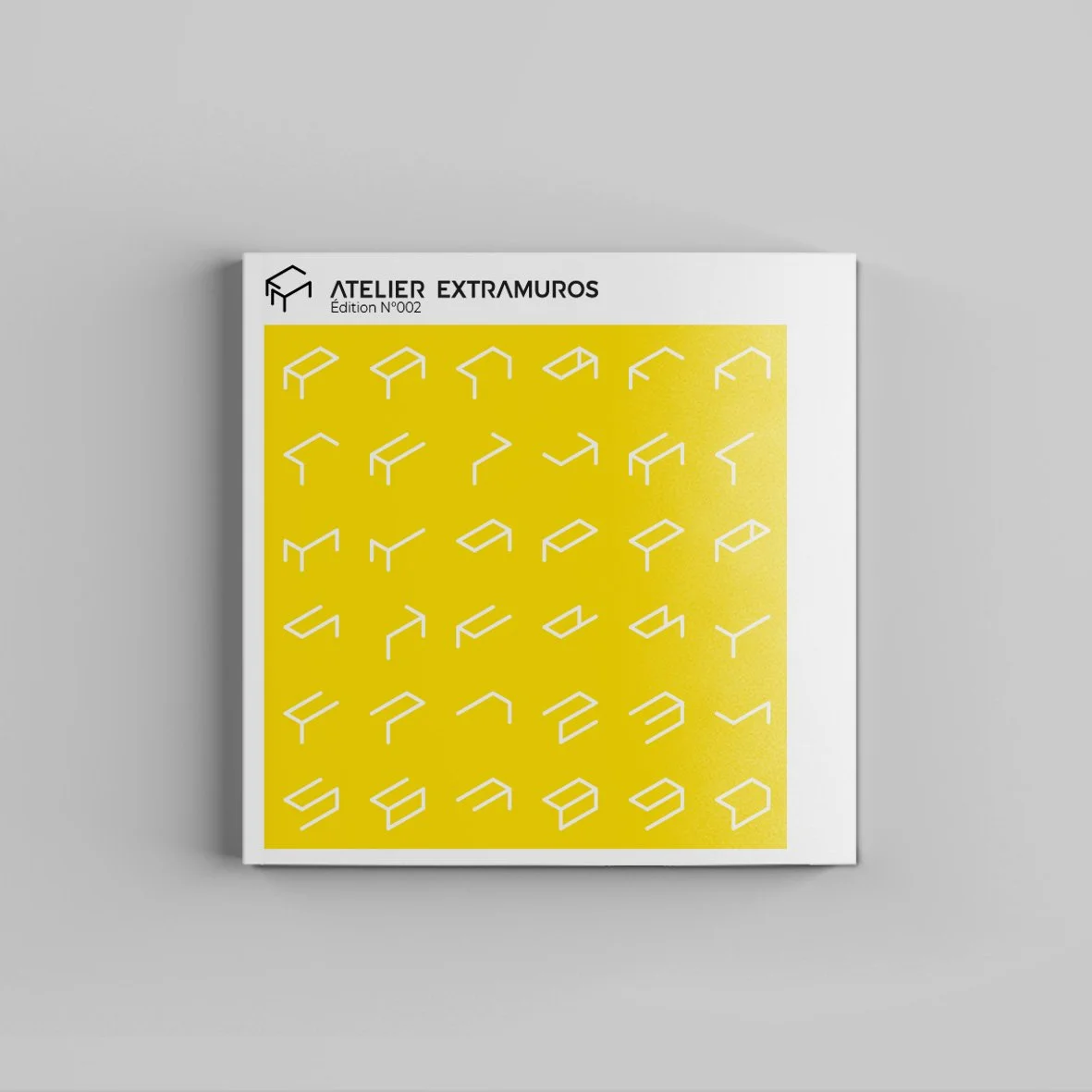
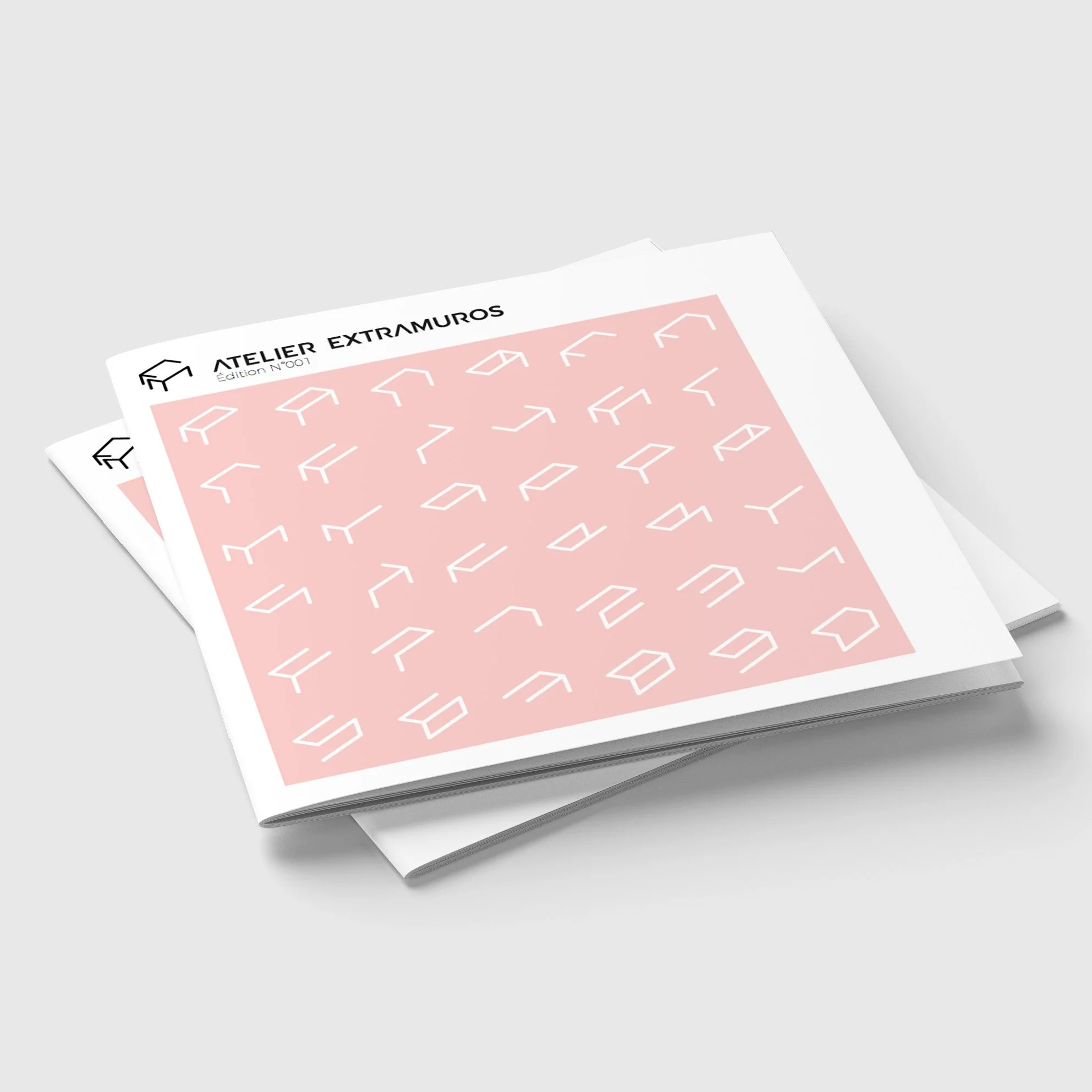
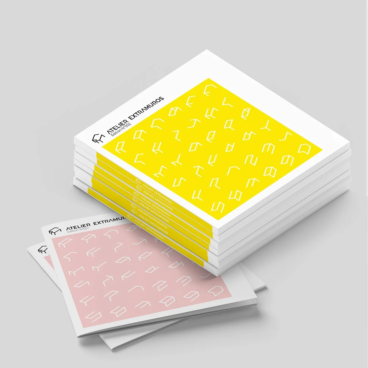
In appearance, the visual identity is a set of lines and symbols combined in the manner of an alphabet representing furniture under construction and referring to the imagination of assembly.
Essentially, it represents the letters E and M of the name 'Extramuros' derived from this alphabet together drawing a table, and directly referring to the way in which the company produces its furniture.
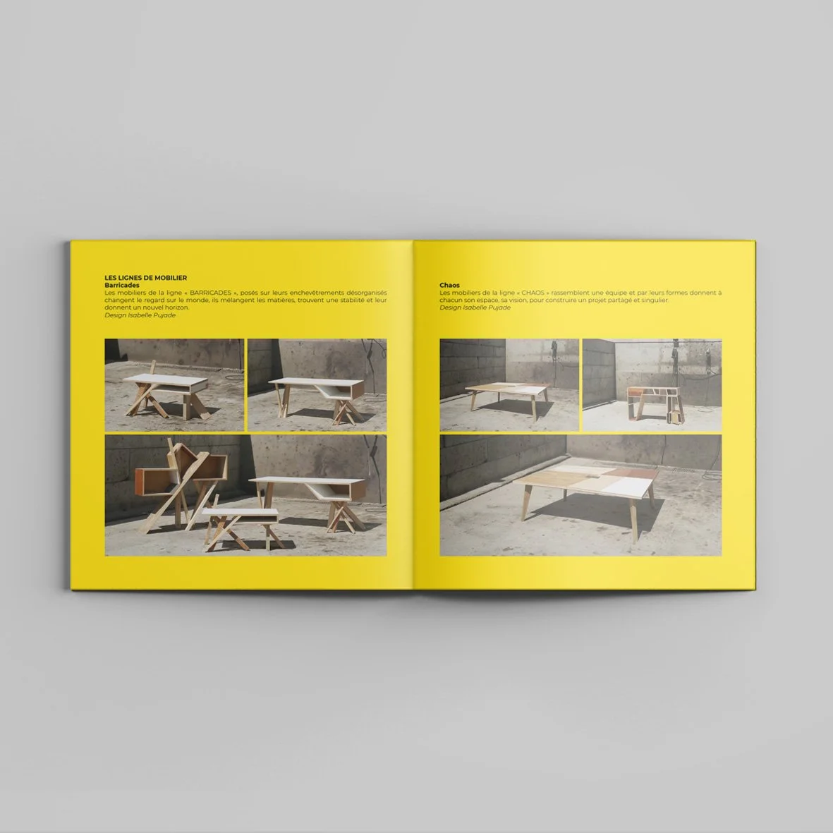
The use of yellow, pink, black and grey play on the declination that Extramuros makes with their furniture, as well as reinforcing their positioning of a fresh, contemporary, dynamic, innovative and creative company.
